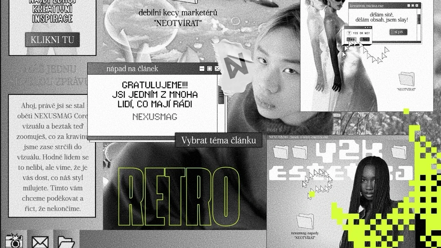

What the Data Says: When Nostalgia Becomes a Mass Trend
This nostalgia wave is not just a feeling shared by a handful of designers in Prague cafés. Look at global reports. The latest Canva Design Trends report shows that searches related to Y2K aesthetics rose by more than 120% year on year, while interest in ’90s grunge and retro scrapbooking jumped by more than 140%. Creative platform Kittl reports similar numbers, tracking the behaviour of hundreds of thousands of creators worldwide. Templates with vintage typography, risograph textures, retro badges and acid graphics rank among the most downloaded assets across categories.
We can see the same dynamic in the Czech market. Just look at how local brands speak to younger audiences. Retro packaging editions from breweries such as Plzeňský Prazdroj and Budvar are no longer aimed only at people who remember the past; they have become collector’s items among people in their twenties. Kofola has long built its brand on nostalgic retro sentiment, mixing it in recent campaigns with modern digital humour and lo-fi aesthetics. The boom in Czech second-hand shops and vintage markets, generating huge organic reach on platforms such as Vinted and Instagram, confirms just how strong the desire for a tangible past is here.
If you work in marketing, there is one essential thing to understand: for younger audiences, retro is not a symbol of obsolescence but of premium quality and humanity. When artificial intelligence can generate a photorealistic, perfectly lit image in three seconds, perfection loses its value. It has become a cheap commodity. Grain, noise, imperfect colour registration and pixelated lettering instead suggest that a real person with a point of view and taste is behind the visual.
Why Now? The Psychology of Digital Burnout
Gen Z grew up with an iPhone in hand and social media algorithms at their backs. From childhood, they have been bombarded with hyper-optimised content that has passed through dozens of filters and A/B tests. The result is visual fatigue. The modern digital environment is sterile, predictable and often alienating. When you are surrounded by global uncertainty, climate anxiety and economic pressure, you instinctively look for an anchor. That anchor is the turn of the millennium, which this generation sees through a pop-cultural myth as an era of carefree living, technological optimism and colourful naivety.
The visual language of the late ’90s and early 2000s offered something today’s web design badly lacks: playfulness, texture and the courage to make mistakes. The web back then was not optimised for maximum conversion. It was wild, experimental and full of personality. When Gen Z reaches for a Mac OS 8 interface, VHS texture or first-generation PlayStation graphics, it is not looking for functional perfection but for emotion. It wants to feel the material, even while looking at an OLED screen.
That is what makes retro such a powerful sales tool. Nostalgic design can bypass rational filters and create an immediate emotional bond. When a customer sees your product wrapped in visuals that remind them of a favourite childhood video game or a cereal box from 2002, they automatically associate it with positive emotions. This effect crosses generations, but it has a particular flavour for Gen Z: it is not nostalgia for nostalgia’s sake, but nostalgia as an aesthetic choice and an expression of identity.
The Visual Remix: How to Deconstruct Retro Trends Well
If you want to use retro aesthetics in your work, do not make the beginner’s mistake of simply copying an old flyer. Modern nostalgia works through remix. Take a historical element, strip away the technical limitations of its era and place it in an ultra-modern context with fast typography and fluid interaction. Here are the main visual currents currently moving through the market.
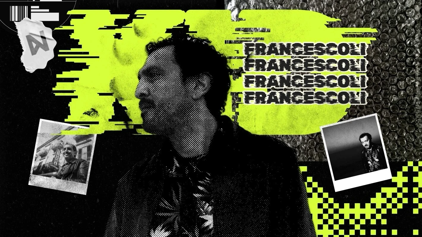
The first major current is Y2K cyber aesthetics. It draws on turn-of-the-millennium futurism, when everyone was looking forward to the year 2000. Typical features include chrome 3D effects, metallic reflections, inflated plastic lettering, holographic gradients and motifs inspired by early science-fiction graphics. In digital design, this style appears in neon green, pink and silver against dark backgrounds. Pair it with a modern product and you get an instantly bold, club-like confidence.
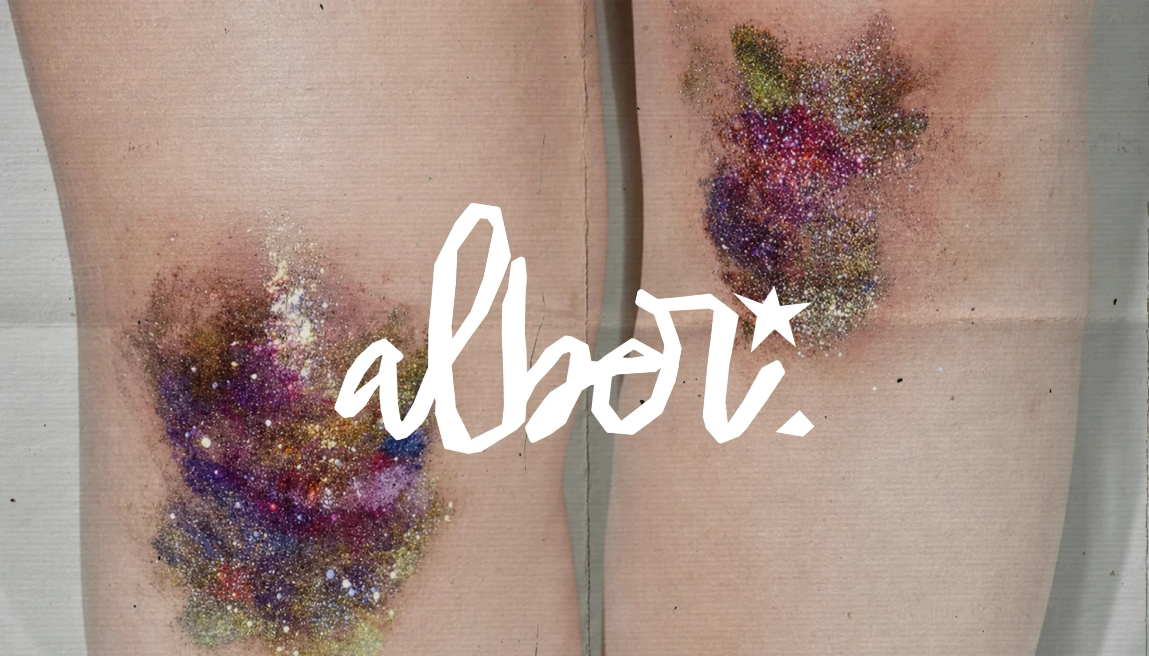
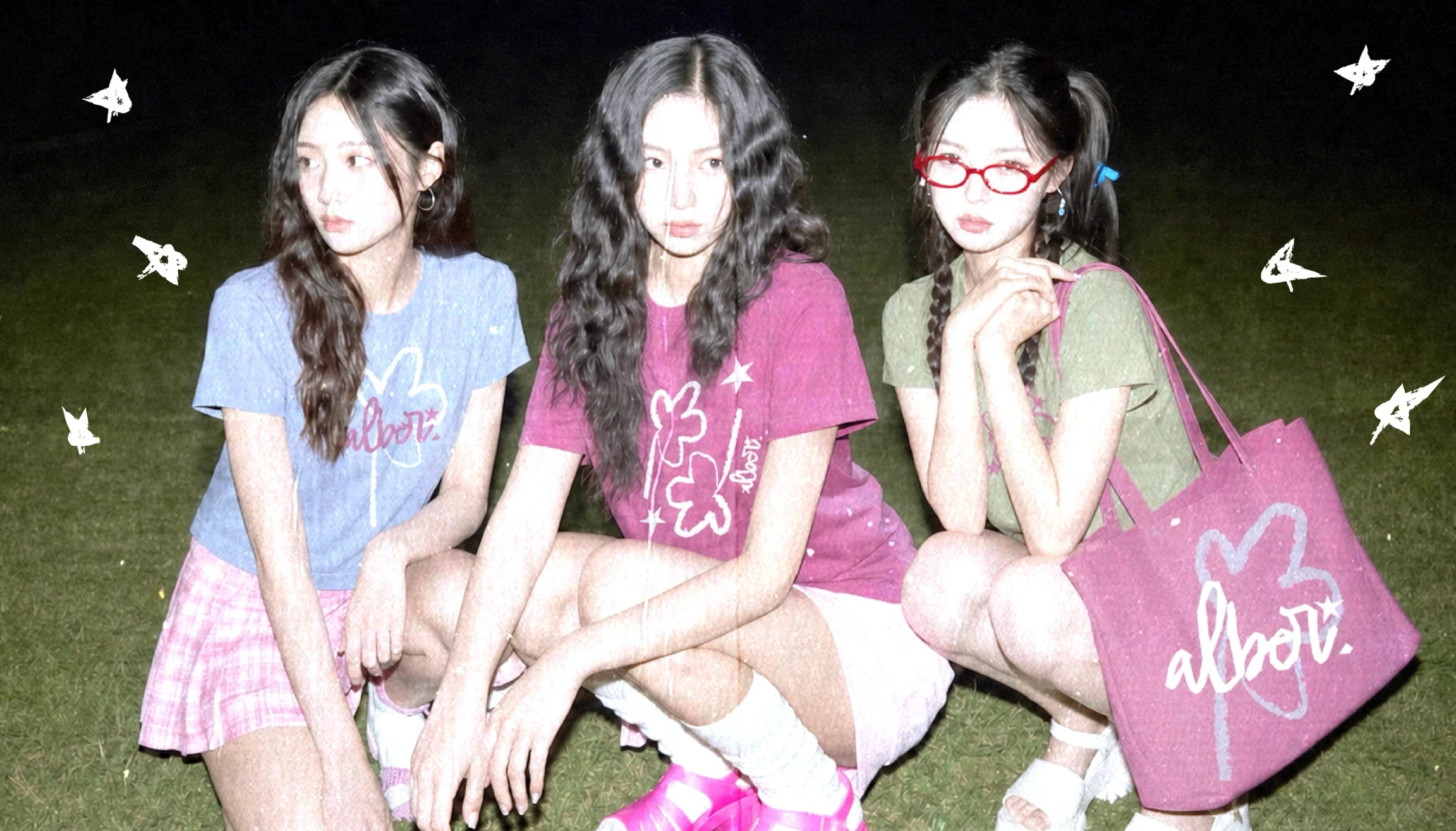
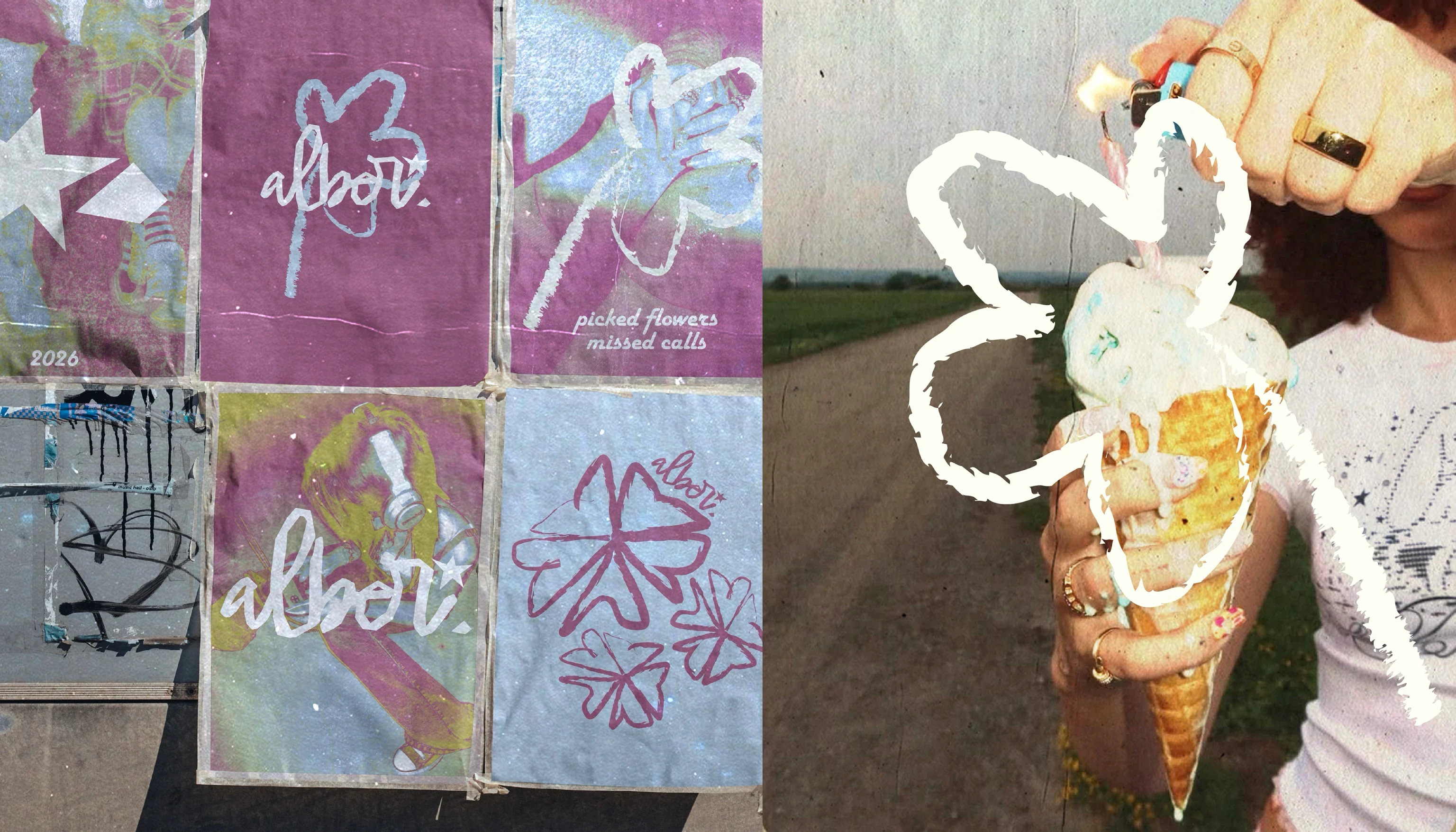
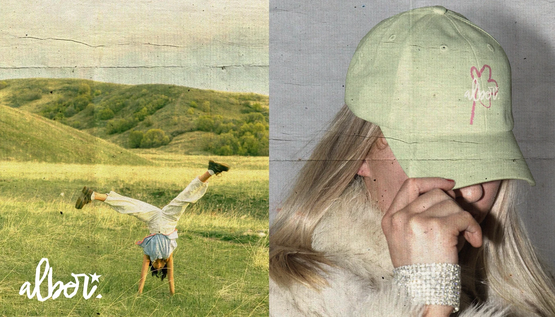
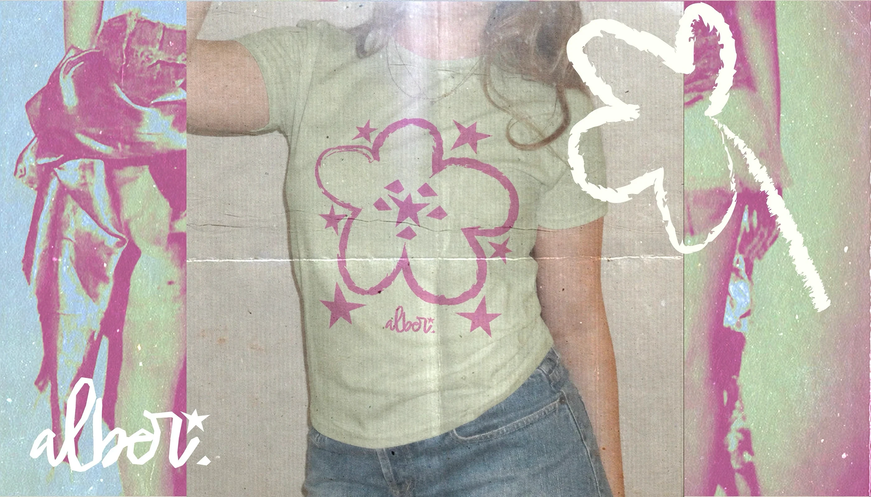
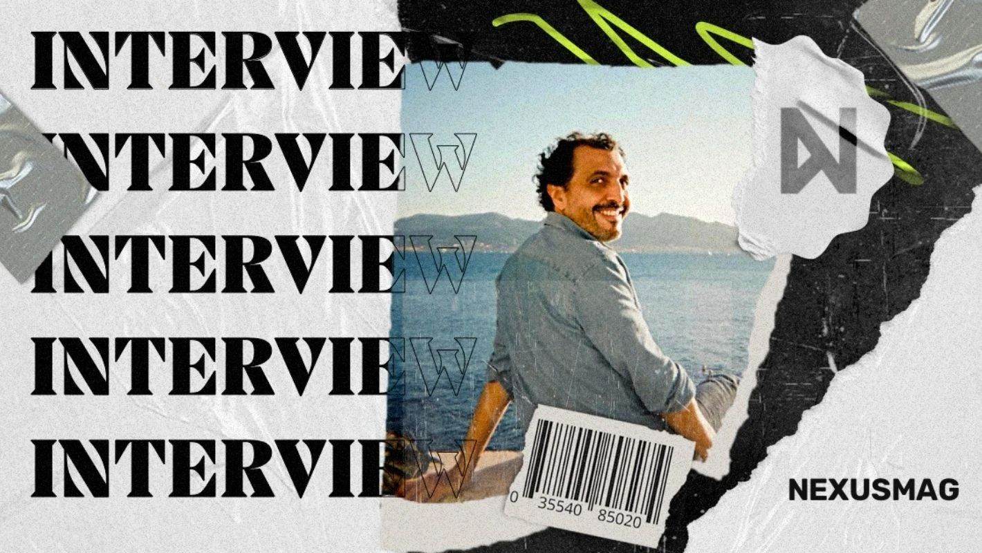
The second strong direction is neo-grunge and lo-fi analogue. It celebrates dirt, grain and printing mistakes. Designers use halftone patterns, simulated risograph printing, torn-paper textures, high-contrast photocopies and faded Polaroid colours. The style works brilliantly for streetwear labels, festivals, cafés and record labels. It gives your message a raw, tangible authenticity you simply will not find in a standard photo library.
The third dominant style is retro corporate design and ’70s typography. Think heavy serif type, warm earthy shades such as orange, mustard and olive, and thick-lined mascots in the style of old cartoons. This approach is prominent in food, drink and lifestyle services. It feels remarkably friendly, human and reliable. Tools such as Kittl have built entire template libraries around this aesthetic, giving smaller brands access to visual depth that once took an experienced illustrator weeks to create.
Step by Step: Bringing Retro into Your Marketing Mix
Before you rush to recolour your whole website in Windows 98 hues, clarify your strategy. Retro design should not be a decorative façade for its own sake. It needs to make sense for your brand and the values you communicate. Here is how to use nostalgia tactically and get the most from it.
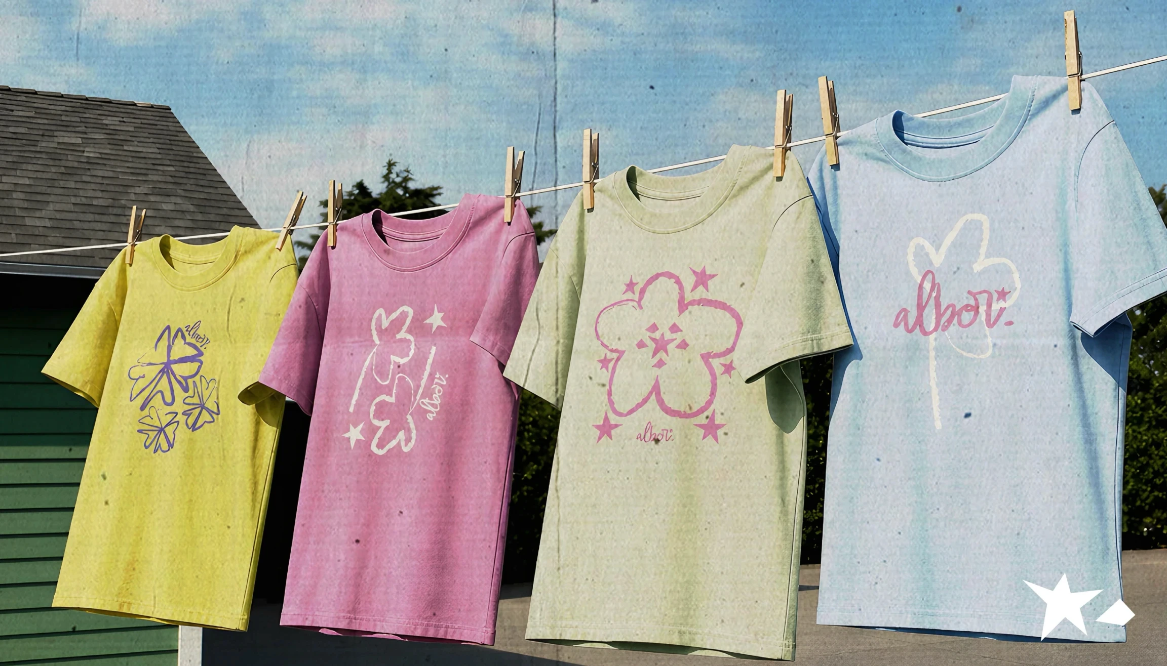
Start with packaging and limited editions. Packaging is an ideal sandbox for testing retro concepts. You do not have to change the company’s entire visual identity straight away. Create a limited summer series that nods to the ’90s. Customers love limited editions, and if the packaging has collectible potential and looks great in a social-media photo, you are onto something. Use grainy textures, retro illustrations and unusual colour combinations that stand out on the shelf among uniform competitors.
Bring retro elements into your digital storytelling. Visual contrast works on social media. Put a hyper-modern video shot with the latest equipment next to footage with a VHS filter, low frame rate or sound effects from old game consoles, and you will immediately break up a monotonous feed. Use old operating-system interfaces for memes or carousel posts. An error window, an old messenger or a text editor set in Courier can make even boring information fun to read and share.
Do not forget sound. Nostalgic marketing is not only visual; sound matters enormously. Audio identity plays a key role on platforms such as TikTok and Reels. Try synthesiser melodies, dial-up internet sounds, old Nokia beeps or 8-bit tunes. Pair a visual with the right audio cue and you can trigger an instant wave of dopamine in the viewer’s brain, increasing video retention by tens of percent.
Bring retro interactions into web development. Skeuomorphism—design that imitates real physical objects—is coming back. Instead of flat buttons, experiment with dimensional buttons that visibly press, switches with metallic reflections or click sound effects. A web portfolio that looks like an old computer desktop with interactive folders can keep visitors on the page far longer than a standard one-page site built from a generic template.
The Traps: When Nostalgia Can Hurt Your Brand
Like any powerful tool, nostalgic design carries risks. The biggest trap is forced inauthenticity. If you are a conservative B2B accounting software company and suddenly start posting pixel art and acid graphics just because they are trending, you will look ridiculous. Your audience will immediately sense a cheap attempt to appeal to younger people. Retro needs to fit your tone of voice and the nature of your product.
Another issue is forgetting usability and accessibility—UX and accessibility themselves. A designer who gets too carried away with ’90s aesthetics can easily forget the basics of contrast, readable text and clear navigation. Brutalist websites with flashing headlines and tiny, illegible type may look great in design competitions, but if an ordinary user cannot find the buy button or navigate the offer, the campaign has failed. Function must not become a casualty of form.
Watch out for cultural context and copyright, too. Drawing inspiration from the past does not mean thoughtlessly stealing other people’s work. If you use specific graphic elements, fonts or visual samples, make sure the licences are in order. Remember also that some retro motifs may carry outdated stereotypes that do not sit well today. Always look at the past through the lens of modern ethical standards.
What Comes Next and How to Get Ready
Nostalgia cycles through culture in roughly twenty-year waves, but the internet and algorithms have dramatically sped up that rhythm. Not long ago, we were riding the ’80s synthwave wave and watching Stranger Things. Now we are deep into Y2K and the late ’90s. What is around the corner? Nostalgia for the early 2010s is already beginning to surface: the Tumblr era, indie sleaze and the first versions of Instagram, with heavy vignettes and overexposed filters.
As a creator or marketer, you do not have to follow every microscopic shift in the trend cycle. The basic principle matters more: people will always want emotion, humanity and a tangible feeling in a digital world. Nostalgic design gives you a language for meeting that desire. It lets you step out of the endless grey of corporate minimalism and create a brand with a heart, a point of view and an unmistakable visual signature.
Open your favourite graphics editor, whether that is Figma, Photoshop or Kittl. Choose one of your current projects and try reworking it with the principles of retro aesthetics. Add grain, reach for bolder typography, break the perfect alignment and give the visual a little of that good old imperfection. You may find that this is exactly the impulse your brand needed to stop blending into the crowd.
Source: Behance